LS One 2020 new design and usability improvements
LS One has gone through a total renovation of the look and feel of the point of sale application and the Site Manager did also receive a facelift. For version LS One 2020 we have redesigned all POS dialogs, created new controls, added UI design possibilities and updated all demo data layouts to go with the new design. These changes have not only modernized the design of the POS but also greatly improved the usability of the product in many areas.
New design
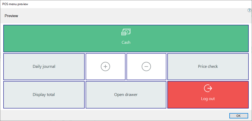
The main color scheme of the POS has been changed from the traditional gray and blue colors to have a lighter white look with green accents.
The demo data layouts were redesigned to match the new color scheme and use the new controls. The traditional Supermarket layout now looks like this.
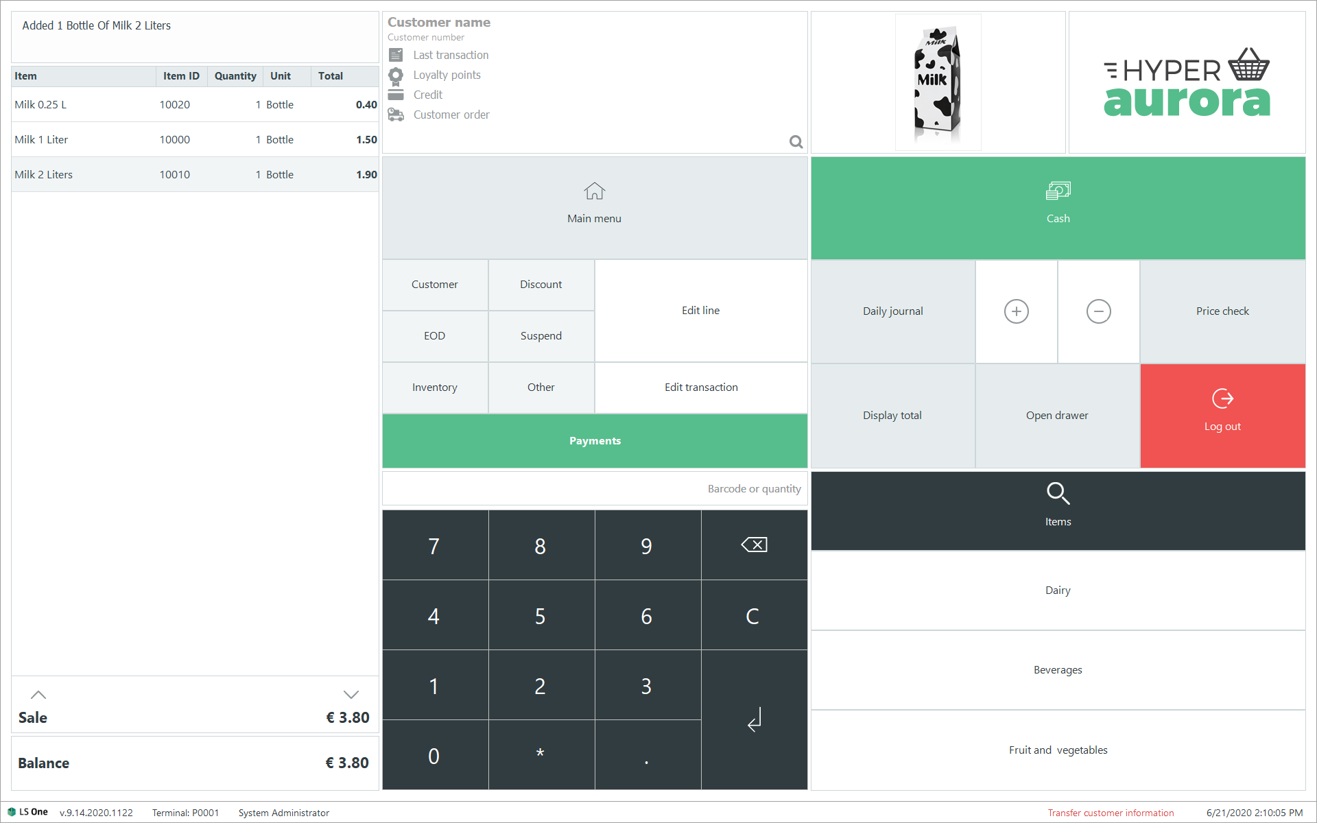
The dialogs also follow this color scheme, with white background and red, green and gray buttons depending on functionality.
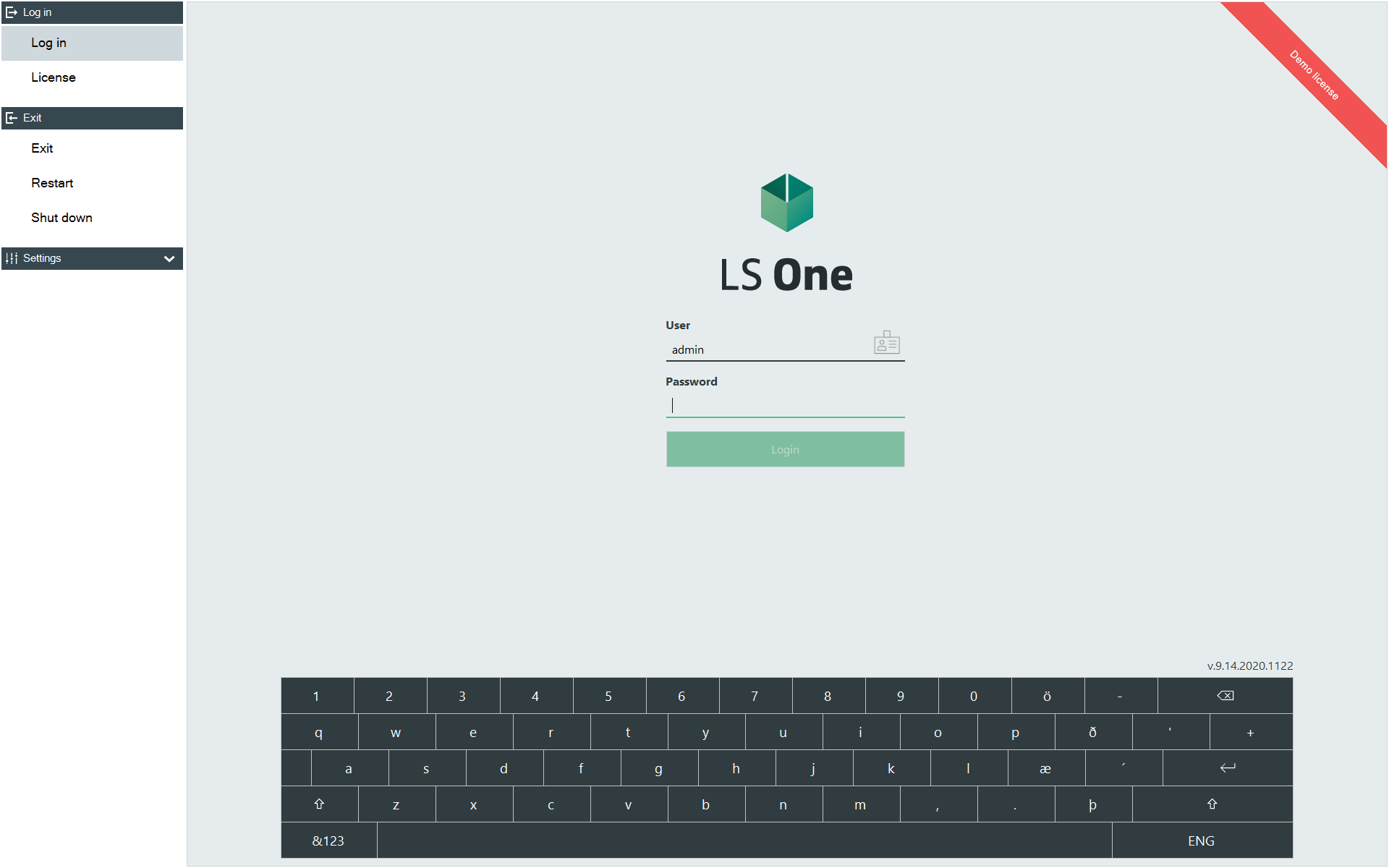
The log in screen also got an overhaul:
New customer control
In previous versions of LS One a 3rd party component has been used for the Customer control, that is the control that is added to the POS layout that displays the selected customer during a transaction. The new control displays selected information about the customer and previous transactions, and allows the user to quickly add a customer to the transaction and to edit a selected customer.
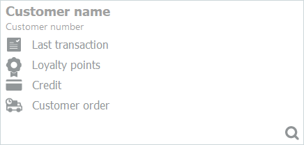
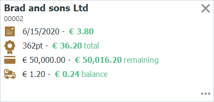
The control can be pressed anywhere to open the customer search to find a customer to add to the transaction.
When the customer is added to the transaction the following information is displayed
-
 -Date and amount of the last transaction of this customer
 -
 - Sum of all loyalty point this customer has accrued and the value of them.
 -
 - The customer account balance and credit limit
 -
 - Information about open customer orders.
To edit an existing customer press the  button and to remove the customer from the transaction press
  .
.
Improved design possibilities in the POS layout
Dialog button configuration
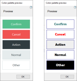
In the 2020 version of LS One we have added the possibility of configuring the colors, borders and styles of all buttons. This means that the user can configure the colors not only of the button grid buttons but also the OK, Cancel and other operation button in the dialog.
We have defined 5 main types of buttons, Confirm, Cancel, Action, Normal, Other.
In the visual profile in the Site manger you can select a style for each type of button which includes settings for background color and font settings.
Return mode
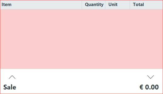
The onscreen receipt panel in the POS changes when the POS is in return mode, that is when the return item operation has been run. The user can in the Visual profile select a border color for the POS receipt and an image that can be displayed in the background. In the image below an all red image has been selected as background image.
Button grid
Settings have been added to the button grid so that the user can now select the border color for the buttons in the selected button grid, the border width and the padding between the buttons. Previously all these settings were fixed.
Button settings
Now both text and image can be placed in the center of a button. If both the image and the text are positioned in the center of the button the image will be placed on top of the text as seen in the image above.
Image fonts can also be used instead of an image file. Then you choose an image font such as wingdings and select the size, color and position of the image. This can be used together with normal text on the button.
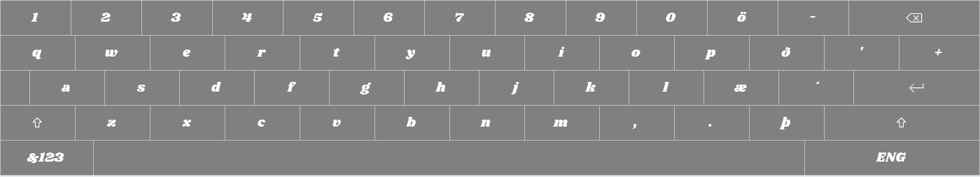
Keyboard setting
The keyboard control used in dialogs and the POS login screen can now be changed with a system style. This enables the user to change the font, font size and color and the background color of the keyboard buttons. The style to edit is called System Keyboard button style.
Usability improvements
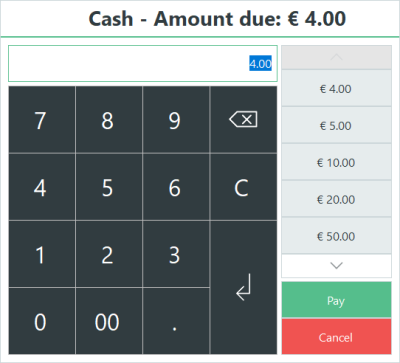
Tender declaration, safe drop and bank drop
The dialogs for tender declaration, safe drop and bank drop have been totally redesigned. When calculating by denomination the user can now enter the counts into fields in a list and see the amounts calculate.
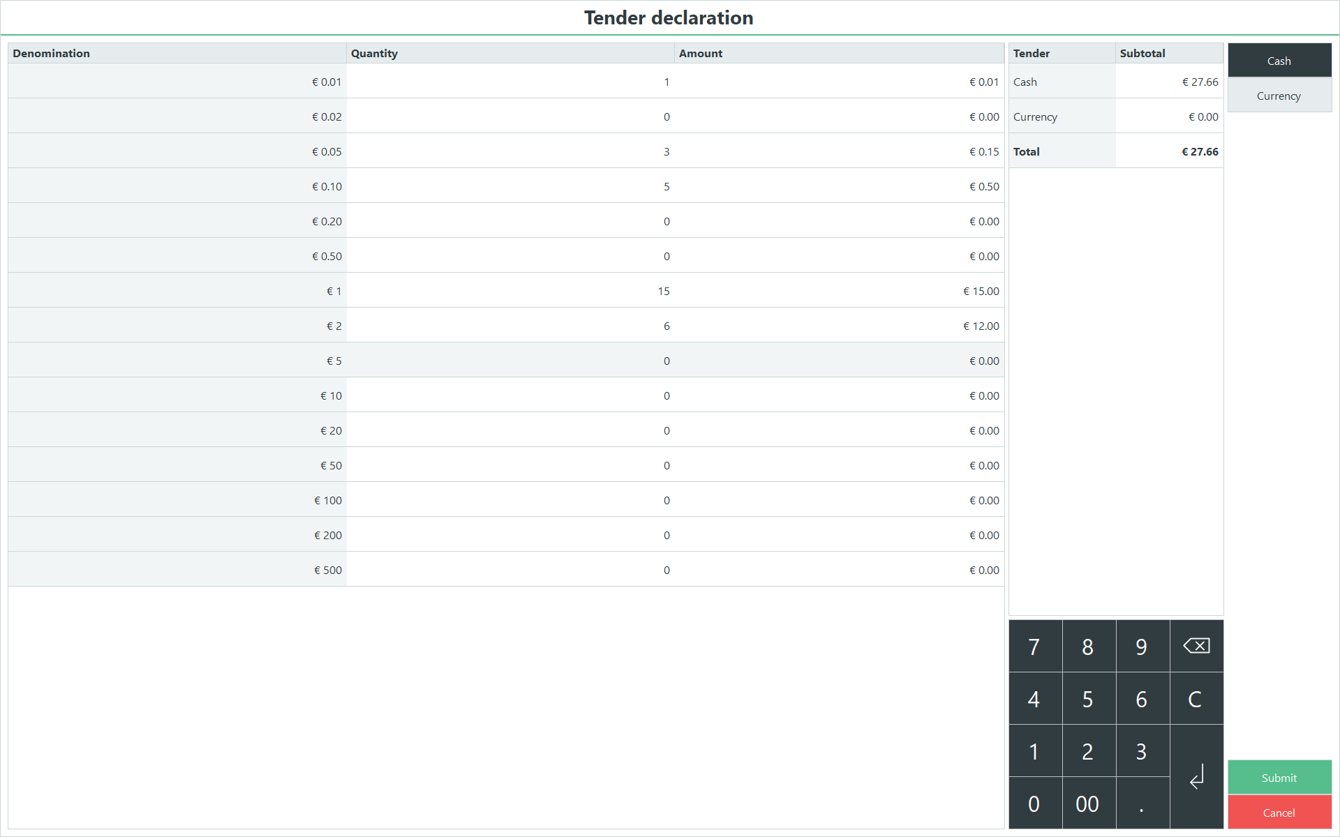
The safe drop and bank drop are the same.
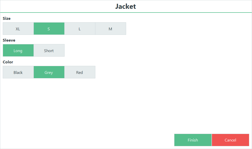
Dimension dialog
When a header item that includes variants is sold in the POS the user must select which variant is being sold.
The dialog will display all dimensions and attributes and the user can select which size, sleeve length and color he is selling. If any item combination is not available this will be displayed with disabled buttons.
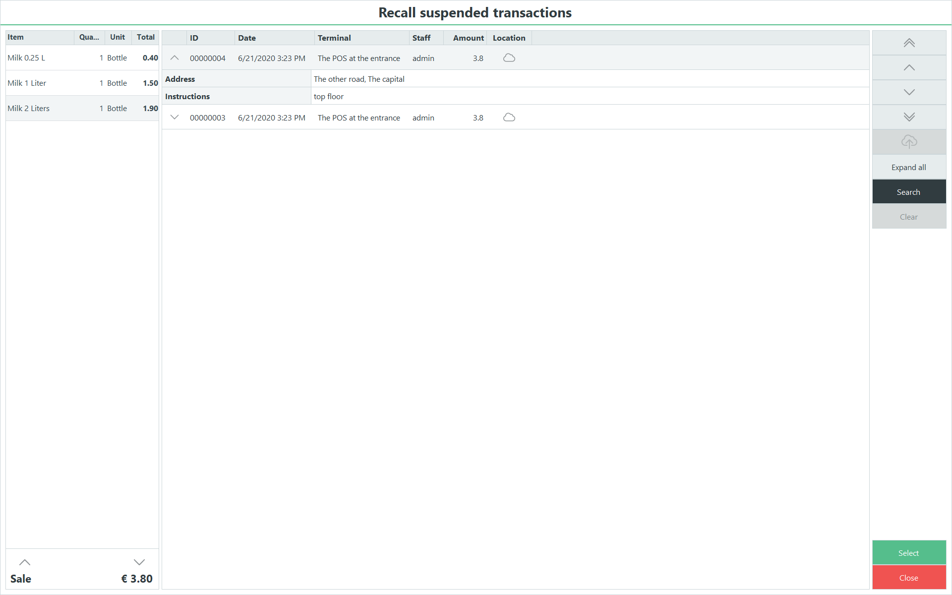
Recall suspended transactions
With suspension you can ask the customer for some additional information. This functionality can be used for and example when doing modifications to items, or capturing information for delivery.
It is now much easier to view the answers to the question and search for the correct suspended transaction.
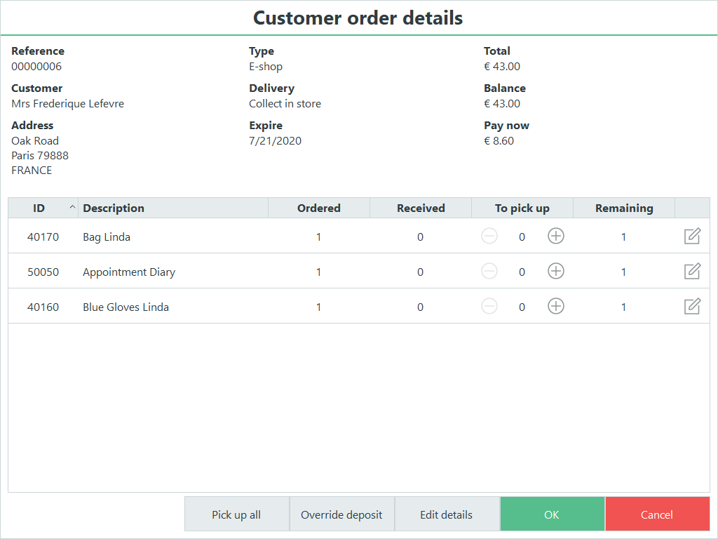
Customer order details dialog
It is now easier to view all the details about an open customer order and to view and edit the quantities to be picked up now and which items are to be picked up later.
The  and
and  buttons can be used for increasing or decreasing the quantity or you can use the edit button to edit the line.
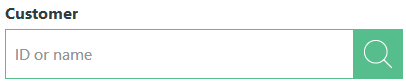
Customer search field
Where a customer needs to be selected in a dialog a new field helps the user to find the customer without using the customer search.
The user can enter a customer ID or a customer name to the field. If the POS only has one match for the customer that customer will be selected but if more than one customer matches the entered information the customer search list will be displayed with the matching customers.
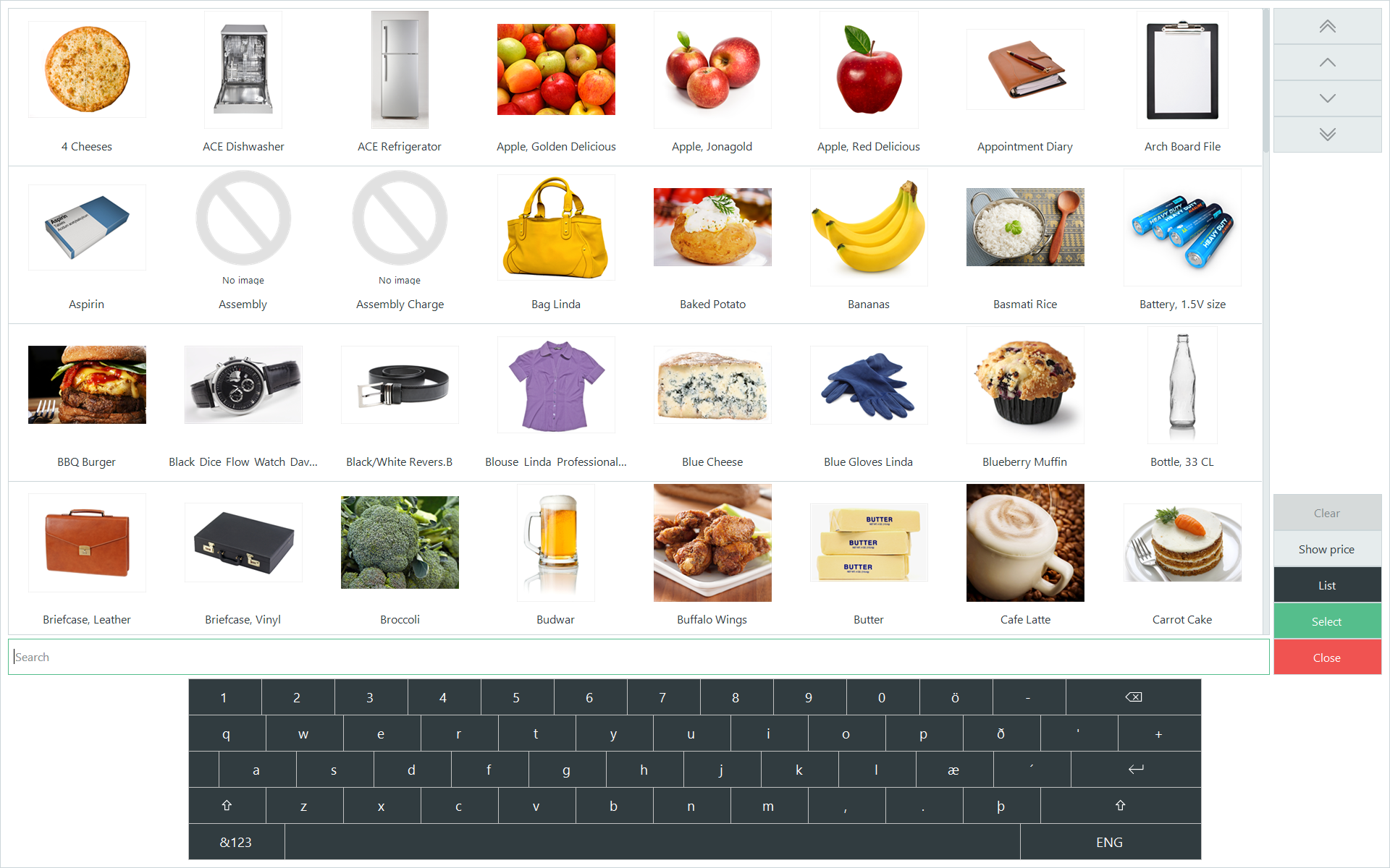
Item search
The item search has been improved signifcantly
Changes in search functionality
- It is possible to search for any parts of the item name. Not only the beginning
- Variant items are not displayed multiple times only the variant header is displayed if the search criteria includes the header item
- It is possible to search for variant attributes such as black or white
- New field has been added to the item view in the Site Manager called Search keywords. The item search in the POS searches in that text field also. This enables you to create search tags.
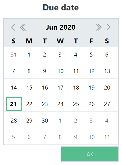
Date picker
Dates can be selected in the POS, such as on an infocode or a suspended transaction question. The new date picker allows the user to view the calendar and pick a date and it is user friendly for a touch screen.
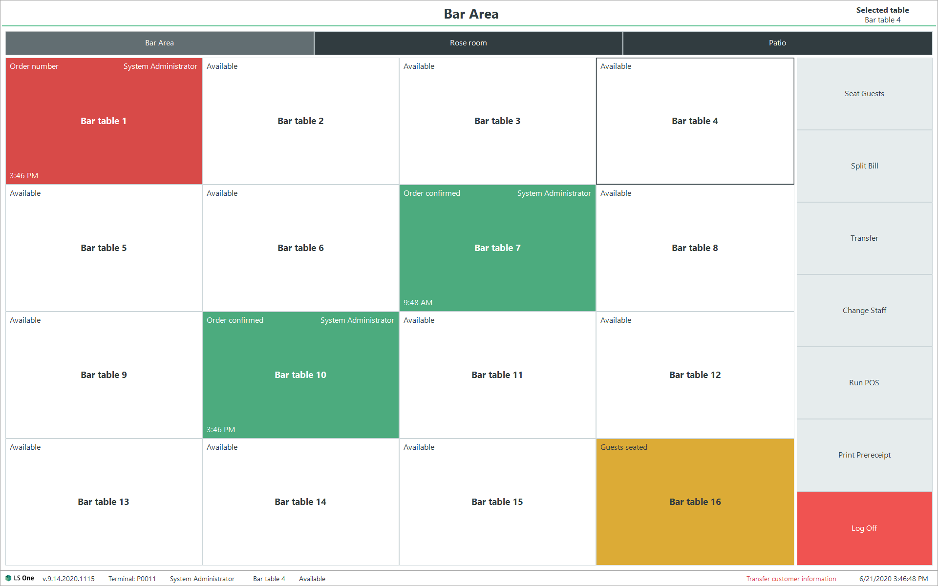
Hospitality - Table management
The usability of the table management screen in the POS has been improved drastically. The hospitality type selected is now visible with a change in the button color. The table selected is marked with a darker border around it. It is also displayed in the header of the screen which hospitality type and table is selected.
Colors of the status has been changed.
- White is available
- Yellow has guests seated
- Red has an order that has not been printed completely
- Green has a fully confirmed order.
- Unavailable tables are light gray with lighter text.
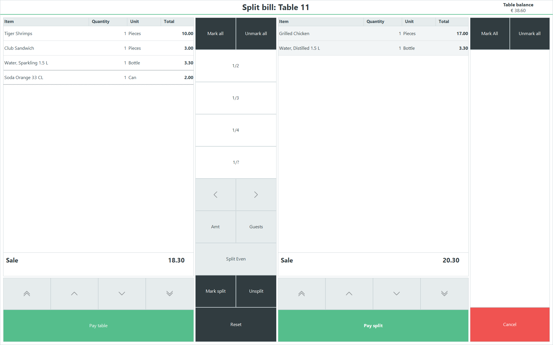
Hospitality - Split bill and transfer table
The split bill and transfer table menus have been improved. These menus are setup in the data so you will need new demodata or import the hospitality data package to see the new menus.
Site Manager
The Site Manager also received a facelift in this release. All icons where changed to match the new lighter and more modern design of the LS One POS.
Here are some examples of feature and fixes that come with the new design:
| Issue number | Description |
|---|---|
| ONE-12305 | Added customer barcode scanning and MSR cards support in the customer order dialog. |
| ONE-12301 | Updated icons for all application in the LS One Suite. |
| ONE-12052 | Item search in image mode is not scrollable by dragging. |
| ONE-11801 | Changed the IPOSPlugin interface so that it returns the a transaction instance. This allows plugins to modify the current transaction where before that was not possible. Refactored the ItemSpecialGroupSearchPlugin to use existing methods in the DialogService to show the item search dialog instead of maintaining it's own copy of the dialog. Added a method to the DialogService that shows the Item Search Dialog with a filter. |
| ONE-11900 | Updated the size of the LS One icon logo in the task bar. It was stretched in previous versions |
| ONE-11772 | Created new text viewer control for receipt preview. |
| ONE-11744 | Created new scrollbar control and changed the old scrollbar in the list view with the new one. |
| ONE-11778 | Enabled vertical scrollbar for all listviews in the POS. Scroll bar is only visible when there are enough rows to scroll. |
| ONE-11701 | The colors and style of the generic button types and the control borders in the POS are now configurable in the visual profile. |
| ONE-11737 | Updated the design of the keyboard input control. |
| ONE-11660 | Added new settings to set which image is displayed in the receipt when returning items. |
| ONE-11705 | Updated the design of the touch error provider. |
| ONE-11585 | Created a new touch friendly calendar control and a dialog that allows the user to select a date. |
| ONE-11365 | Added system style to control POS receipt lines |
| ONE-11371 | Created a new button control with a type setting based on which the style of the button is chosen. Updated all buttons in touch scroll panels. |
| ONE-11388 | The layout of the keyboard has been updated with a simpler look and new buttons. |
| ONE-11377 | Created a custom text box control that allows ghost text and configurable font size regardless of control height. |
| ONE-11363 | Added new system style for keyboard. |
| ONE-11370 | All numpads in the POS now use the same system styles. |
| ONE-11362 | Added border width, border color and margin settings for POS menu headers. |
| ONE-11382 | "Added text alignment setting for buttons. Setting both text and image alignment to center will now display the image above the text without overlapping." |
| ONE-11369 | The color border of the main page POS controls is configurable in code within the ColorPalette themes. |
| ONE-12156 | Updated the text on the splash form dialog when starting the POS. |

